Hero
 1 min read
Hero sections
About
The Hero Sections library provides a collection of ready-made, fully customizable hero blocks for your pages.
Each hero is built as a drag-and-drop Framer component, so you can simply place it on the canvas and start editing — no coding or manual setup required
How it works
Drag any hero component from the assets panel onto your page
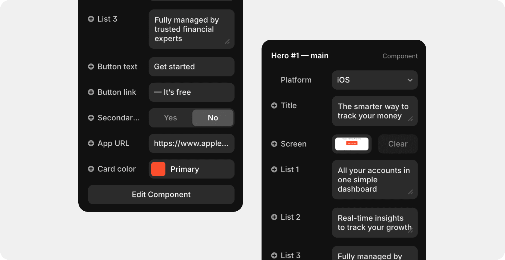
Select it on the canvas to reveal quick controls in the right sidebar
Adjust text, images, buttons, and colors directly — all content fields are editable without opening the component itself
The layout automatically adapts to desktop and mobile breakpoints

Hero categories
We have prepared two categories of Hero sections:
SaaS — 12 variants
Mobile app — 4 variants
Add new hero
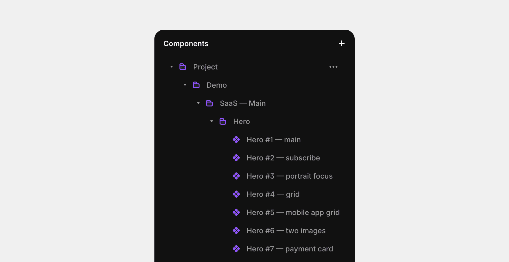
To add a new hero section, go to Assets > Components > Project > Demo > Saas — Main > Hero
Next, simply drag the desired version of the section onto the workspace.
Delete current hero (select the current hero section and press the delete button on your keyboard)
Drag the component of the new hero section to the workspace
Set the following parameters for the desktop version of hero: width (relative 100%), height (fit or viewport)
For the tablet version of hero: width (relative 100%), height (fit or viewport) and in the right panel, select variant: tablet
For the mobile version of hero: width (relative 100%), height (fit or viewport) and in the right panel, select variant: mobile
Last updated on
December 2, 2025