Code components
 1 min read
Code components
About
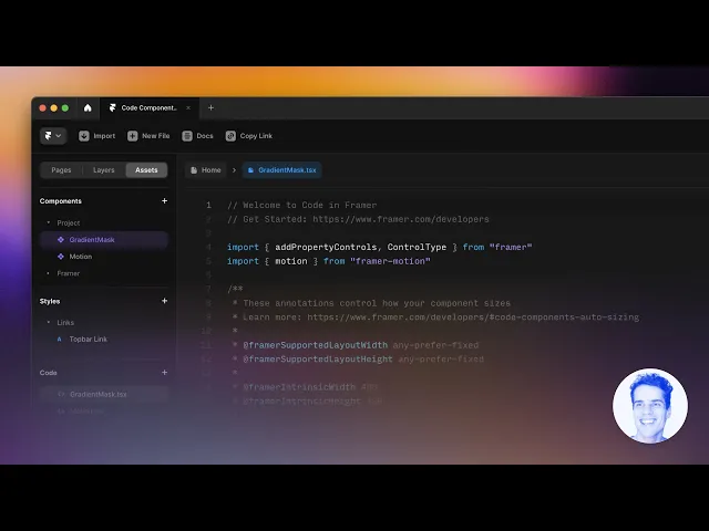
Code components extend your Framer project beyond visual design. All components are located in the section Code
They let you add logic, interactivity, and dynamic data using React — while keeping the same visual editing workflow. In this section, you’ll find all custom code components included in the template. Each one is built to solve specific UI or UX needs — from displaying reading time to creating interactive QR codes and search hotkeys.
You can use them as they are, or open the files in the code folder to customize behavior, styles, or exposed property controls.
We strongly recommend not editing the code components directly unless you’re comfortable working with React
Hero title
The HeroTitle component is designed for creating expressive headlines with inline images — perfect for hero sections or landing page intros. It automatically splits your text into separate words and lets you insert one or two images between them for a dynamic visual accent.
Main controls:
Text — the main headline
Image 1 / Image 2 — upload images to appear inside the line of text
Image 1 Pos / Image 2 Pos — move the image left or right to change its position between words
Tag — defines the HTML tag (h1, p, etc.)


QR code
You just need to paste your url and it will automatically generate the correct QR code.


Countdown
The Countdown component displays a live timer that counts down to a specific date and time.

Search hotkey
The SearchHotkey component adds a quick-access search input that can be triggered by a keyboard shortcut — just like in modern apps or documentation sites.
By default, pressing ⌘ K (on Mac) or Ctrl K (on Windows) focuses the search field instantly, improving navigation and user flow.

Navigation
The QuickNavigation component builds a mini “On this page” menu from your headings and keeps it sticky while you scroll.
It auto-scans the page for visible h2–h6, creates unique anchors, and highlights the section currently in view. Clicking an item smooth-scrolls to that heading, accounting for your sticky header offset.
The component does not need to be configured, just add headings to your docs entry and the quick navigation will be automatically.

Read time
Component automatically estimates how long the current page will take to read.

Last updated on
October 20, 2025